Template
Lbox
From Dogcraft Wiki
(proper documentation + templatedata) |
mNo edit summary |
||
| (2 intermediate revisions by the same user not shown) | |||
| Line 1: | Line 1: | ||
<noinclude> | <includeonly><templatestyles src="Lbox/styles.css" />{{Box | ||
|class=lbox | |||
|style=box-shadow: 0 2px 3px rgba(85, 85, 85, 0.2), 0 0 0 1px rgba(85, 85, 85, 0.2); transition: box-shadow ease-in-out 0.2s; border-radius:5px; min-width:15%; | |||
|headerstyle=height:calc(30% - 0.6em); | |||
|width={{{width|25%}}} | |||
|height={{{height|400px}}} | |||
|link={{{link|{{{title|}}}}}} | |||
|title={{{title|}}} | |||
|titlecolor={{{titlecolor|white}}} | |||
|image={{{image|}}} | |||
|content={{{content|}}} | |||
|footer={{{footer|}}} | |||
}}</includeonly><noinclude> | |||
{{TemplateStyles}} | {{TemplateStyles}} | ||
==Linked box template== | ==Linked box template== | ||
The linked box or '''lbox''' template is a specialized version of | The linked box or '''lbox''' template is a specialized version of {{tt|Box}} It is an interface template for creating containers that also serve as links, useful for navigation. Used across the wiki on various pages, such as the main page. Please check the template parameters before use! | ||
This template is only transcluding a specific configuration of | This template is only transcluding a specific configuration of {{tt|Box}} with added CSS. | ||
=== | ===Example(s)=== | ||
====No image==== | ====No image==== | ||
<pre style="white-space:pre-line;"><nowiki>{{lbox | <pre style="white-space:pre-line;"><nowiki>{{lbox | ||
| Line 57: | Line 69: | ||
</div>''This example has been scaled down'' | </div>''This example has been scaled down'' | ||
===Template data=== | |||
<templatedata> | <templatedata> | ||
{ | { | ||
| Line 156: | Line 152: | ||
} | } | ||
</templatedata> | </templatedata> | ||
{{Interface template}} | |||
</noinclude> | </noinclude> | ||
Latest revision as of 01:36, 12 July 2022
|
This template uses TemplateStyles: |
Linked box template
The linked box or lbox template is a specialized version of {{Box}} It is an interface template for creating containers that also serve as links, useful for navigation. Used across the wiki on various pages, such as the main page. Please check the template parameters before use!
This template is only transcluding a specific configuration of {{Box}} with added CSS.
Example(s)
No image
{{lbox
|title=Survival 4
|width=300px
|height=370px
|content=The fourth dogcraft survival world, running from 1<sup>st</sup> April 2020 to 14<sup>th</sup> March 2022. This was the first time survival was split into multiple interconnected worlds, which were called Husky and Beagle. These worlds ran on versions 1.15.2 to 1.17.
}}
generates:
Survival 4
With image
{{lbox
|title=Survival 4
|width=300px
|height=370px
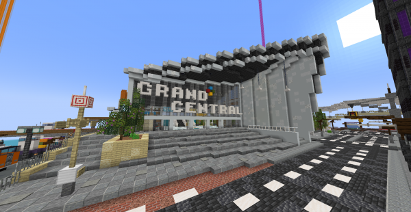
|image=Grand Central Station - Shepherd.png
|content=The fourth dogcraft survival world, running from 1<sup>st</sup> April 2020 to 14<sup>th</sup> March 2022. This was the first time survival was split into multiple interconnected worlds, which were called Husky and Beagle. These worlds ran on versions 1.15.2 to 1.17
|footer=This is a footer
}}
generates:
Flexbox layout example
For more complex layouts, this template can be used together with a flexbox container.
<div style="display:flex; gap:10px; justify-content:center;" class="flex-mobile-wrap">
{{LBox|title=Survival Railway Network|width=none}}
{{LBox|title=Nether Transport Network|width=none}}
{{LBox|title=Road & Horse Network|width=none}}
{{LBox|title=Other Railway Network|width=none}}
{{LBox|title=Connected Seas Coalition|width=none}}
</div>
generates:
This example has been scaled down
Template data
A specialized version of [[Template:Box]] for creating containers that also serve as links.
| Parameter | Description | Type | Status | |
|---|---|---|---|---|
| Title | title | The container's title
| String | required |
| Content | content | The container's content. This may be almost anything that can go on a normal page, such as wikitext, files, links, other templates, html, etc.
| String | required |
| Link | link | The target page where the container leads upon clicking.
| Page name | required |
| Maximum width | width | Parameter for setting the container's maximum width.
| String | suggested |
| Footer | footer | The content of the footer. Use this if you always want to display something at the bottom of the box.
| String | suggested |
| Image | image | For setting an image as the header background.
| File | suggested |
| Height | height | Optional parameter for the container's height
| String | suggested |
| Title color | titlecolor | Optional parametera for setting title text color, useful when using an image as the header background.
| String | suggested |

