Dogcraft Logo
From Dogcraft Wiki
"Our very own MudDog has created what can only be described as a rediculously epic logo to represent Dogcraft.net and the Cyberdog Community - it is now our OFFICIAL Cyberdog logo!!" ReNDoG, 16th August 2012, in the announcement forum post
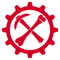
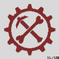
The Dogcraft Logo, sometimes referred to as the Cog, Bone & Pickaxe, is the logo of the Dogcraft community.
It was originally designed by MudDog shortly after the founding of the website and was unveiled on the 16th of August, 2012 in a forum post by ReNDoG.
Design
The logo consists of a thin cog comprised of twelve teeth. Centrally positioned inside the cog is a pickaxe facing -45°. Overlapping the pickaxe in the mirror direction (45°) is a bone.
These three elements—the cog, pickaxe and bone—all represent the three pillars/themes of the community upon which members are united by; the cog representing the steampunk motif of "Cyberdogs"; the pickaxe representing Minecraft and the bone representing ReNDoG himself.
Fonts
To accompany the Dogcraft logo, ReNDoG and his Dogcraft community have used a few font faces. Most commonly accompanying the logo is the aforementioned Visitor BRK font family used in ReNDoG's user icon on YouTube. The font has seen heavy usage, particularly in graphics for earlier versions of the Dogcraft.net site, though it still can be seen in ReNDoG's intro and outro screens.
With the community branding overhaul that took place alongside the redesign of the Dogcraft.net site in March of 2020, the Nunito Google font began being used in favor of Visitor BRK, which now sees use on the website, Wiki and social media accounts.
History
" The Dog made me think of a bone, craft => minecraft => pick axe. Sketched it up, showed Ren. We both kinda liked it but it wasn’t quite there yet. Added a lil’ 3D to the pick. Closer. Then added the cog teeth. And boom that was it!" MudDog, explaining the logo's origin
The logo was created by MudDog, who designed it in cooperation with ReNDoG for use on the original Dogcraft.net website. Originally, the logo's cog was a hollowed circle and the pickaxe lacked 3D definition. Teeth were added to the cog and the pickaxe was made more three-dimensional before the final version was unveiled in a forum post dated the 16th of August, 2012. Since then, a wide variety of variations and parodies of the logo have been applied across the Cyberdog community.
During the website redesign in March 2020, the design and color scheme of the website was updated and with it the Dogcraft logo was given a facelift, with it and official variants (see below) switching to using a maroon background instead of a bright red one.
Variants
Since the logo was created near the start of the Dogcraft community in August 2012, it has seen widespread use, becoming a symbol representative of ReNDoG and his fans. Through the years, the logo has been adapted and parodied extensively, seeing use across a wide range of multimedia Cyberdog projects, events, merchandise and services. This is most commonly achieved by replacing the pickaxe and bone positioned inside the cog with a different icon or symbol. Recognizable parodies include the Dogcraft Wiki logo, featuring a Linux Libertine letter "W" glyph replacing the pick and bone in the middle; the Dogcraft Discord logo, featuring a radio; and ReNDoG's channel icon used between 2014 and March 2021—a red-on-white variant with the text "RD" in the Visitor BRK typeface.
Renpire Logo
" The thinking behind this logo is: 'Rendog' is made up of two equal parts - Half me (the Dog), and half the Cyberdog Nation (the Cog). This logo is trying to show how we work symbiotically together, how you guys are as much a part of this as I am! :)" ReNDoG, on the new Renpire logo
In October 2020, ReNDoG held a vote on his Twitter to help decide on a design for a new logo, with the idea being that it would replace the existing branding on the site. After a few days, Option 3 (pictured) won the vote and was selected. The logo appeared in a few places on the server while it was in use by Ren, such as the lobby navigational maps. On February 3, 2024, ReNDoG stopped using the Renpire logo and reverted to a red variant of the Dogcraft cog.
Gallery
- Official Dogcraft Logo variants
ReNDoG's channel icon (Feb 2024)

Base Dogcraft cog logo

Dogcraft Wiki logo

Staff Team logo

Creative Team logo


- Special variants

Former Dogcraft Discord logo (2015-2023)

DC Server 5th anniversary variant

DC Server 5th anniversary animated variant

Pride variant (2021)

Wiki pride variant (201)
- Examples of community variants

Dogcraft Sandbox logo

Dogcraft Stream Crew logo

DoggyWood logo

Emblem logo
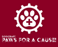
Paws For A Cause initiative logo
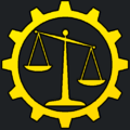
DC Courtroom logo
Ouranos city logo & banner
In-game Map Art of the logo

| |||||||||||